Surface
A Time Capsule of the Present Moment
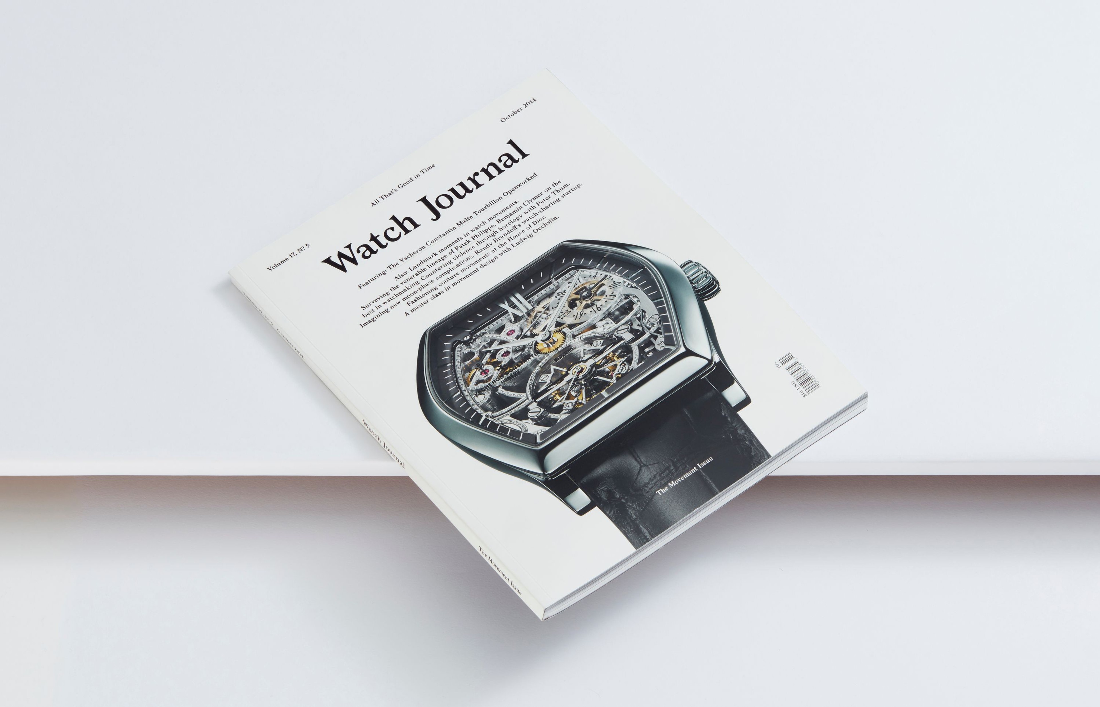
Noë & Associates has designed Surface since Mark Noë first collaborated with Marc Lotenberg to reinvent the magazine in 2013, on the original premise that design should serve as a canvas for stories and the people behind them — never a distraction from them.
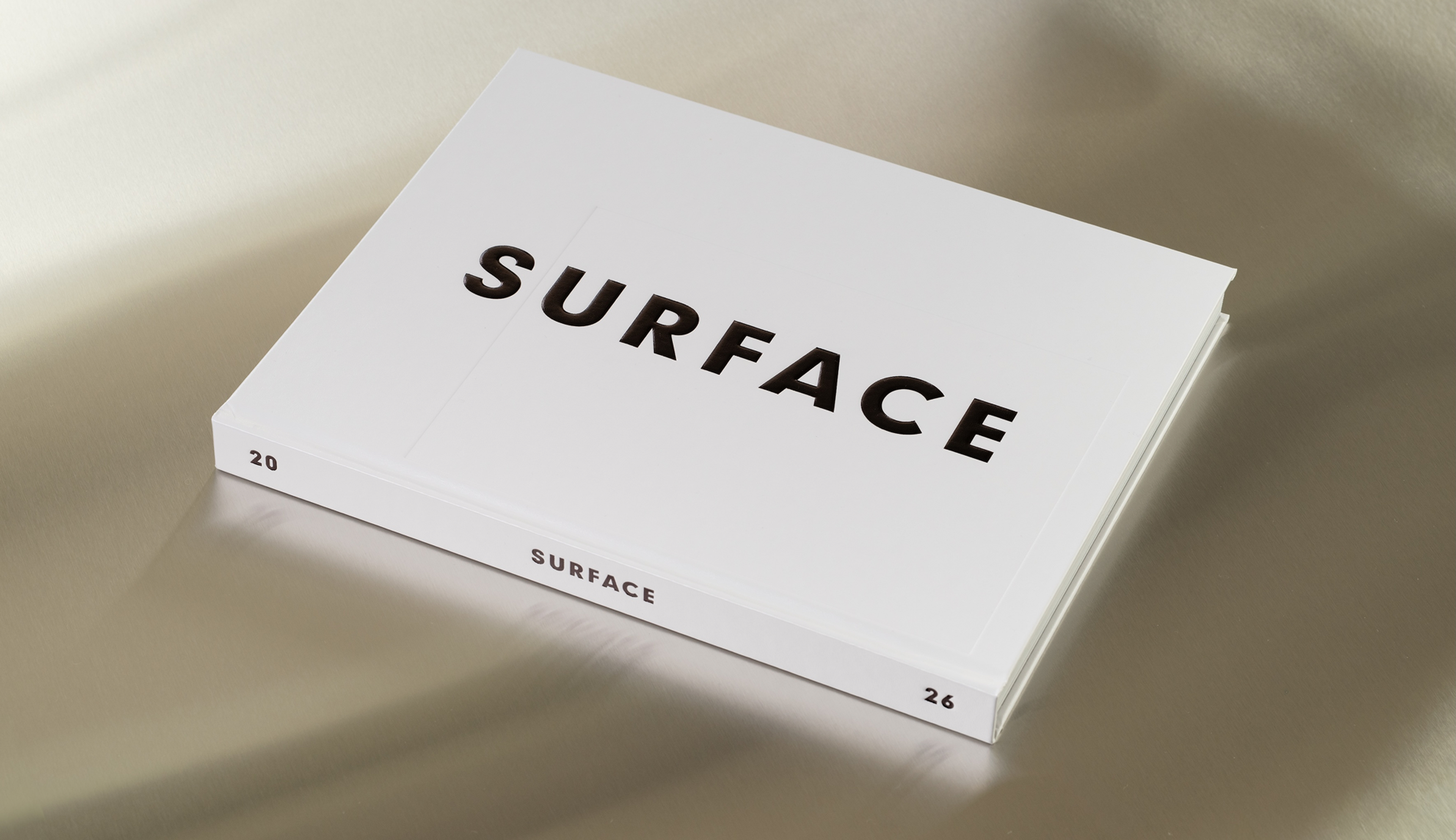
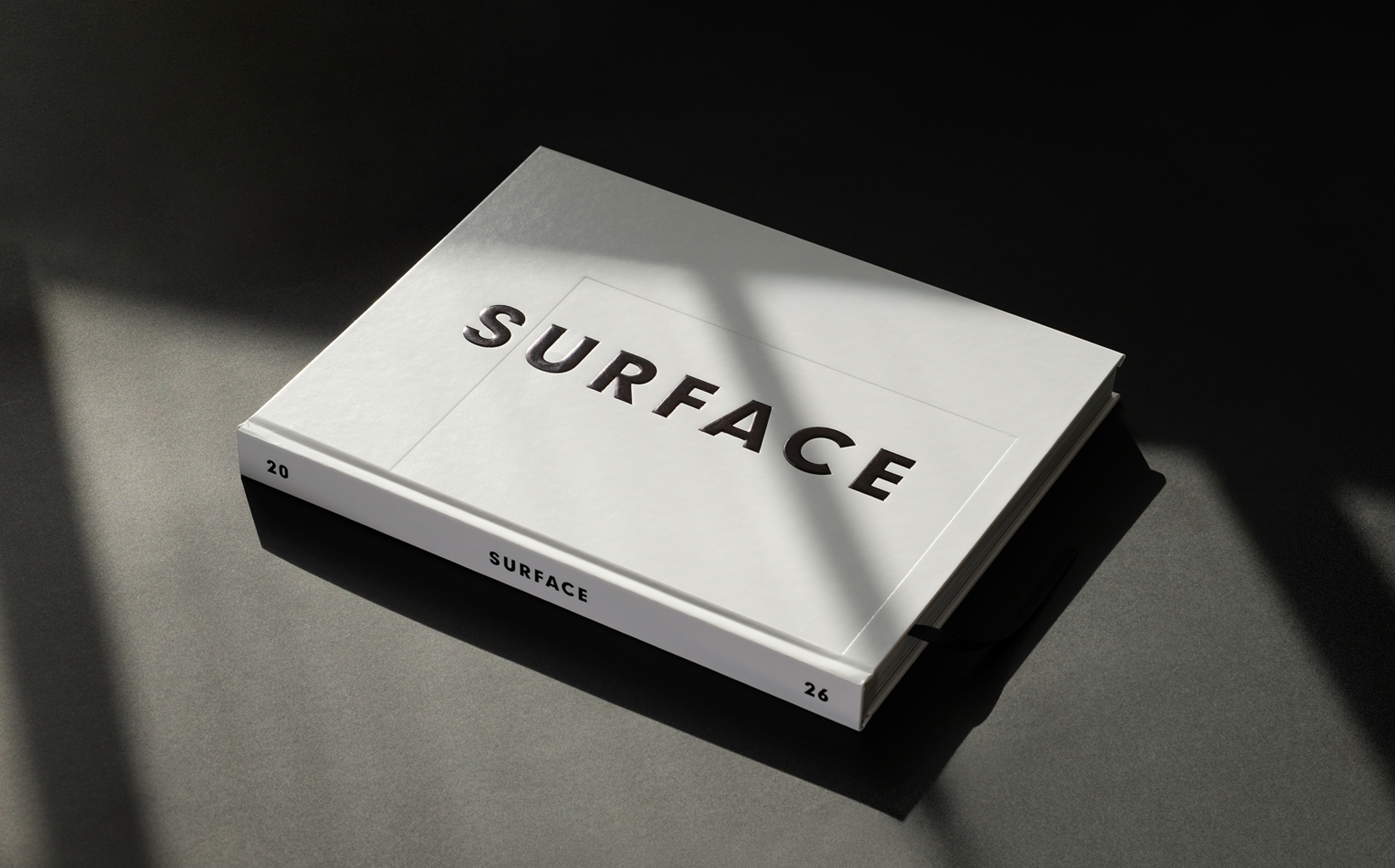
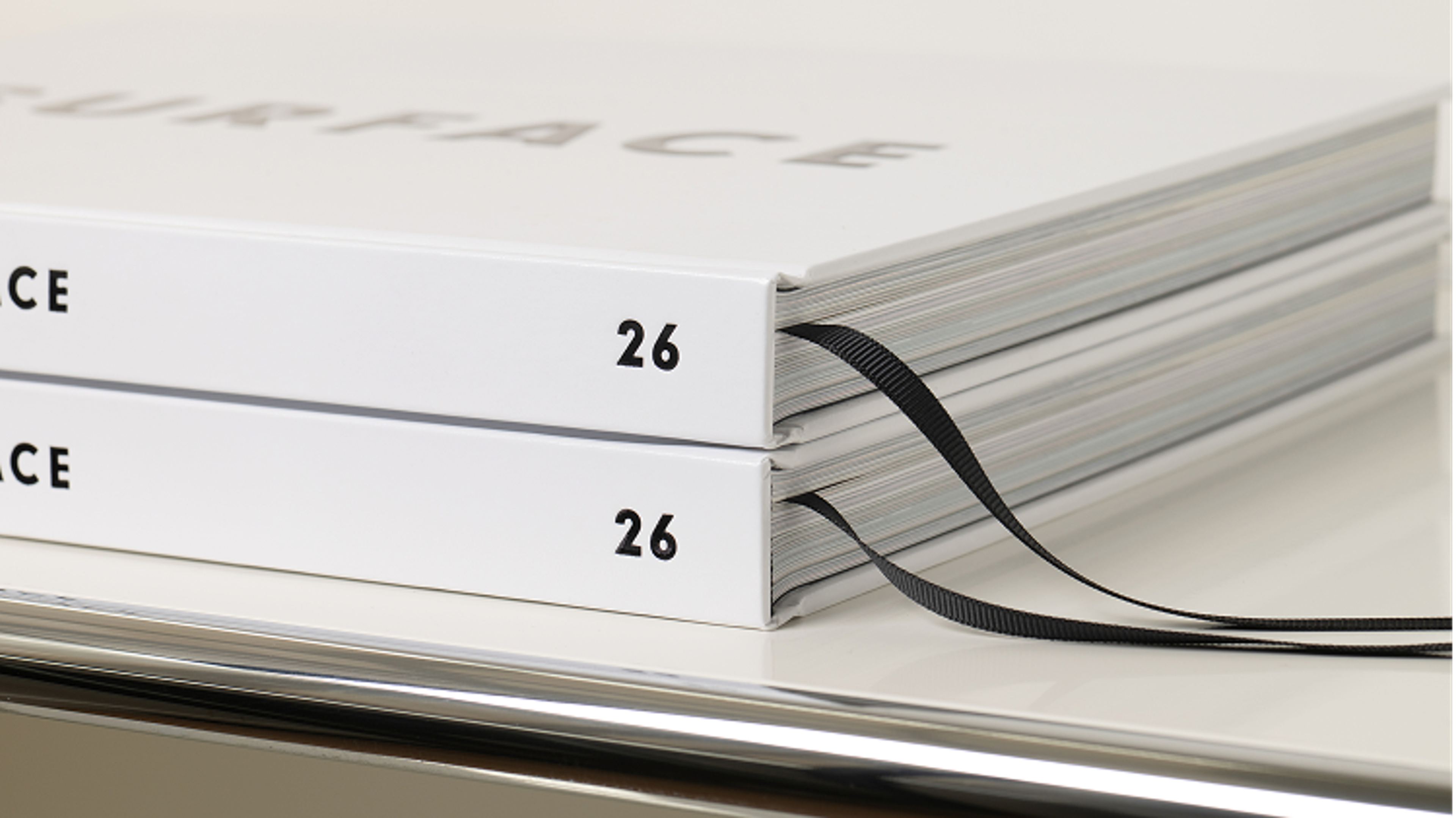
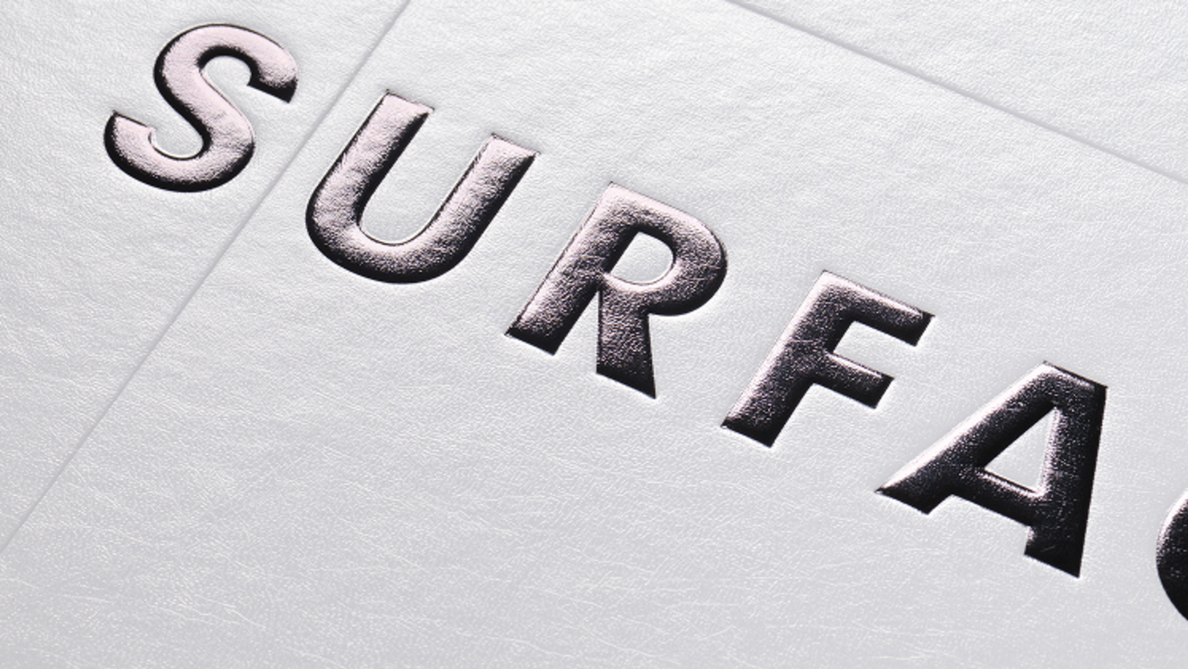
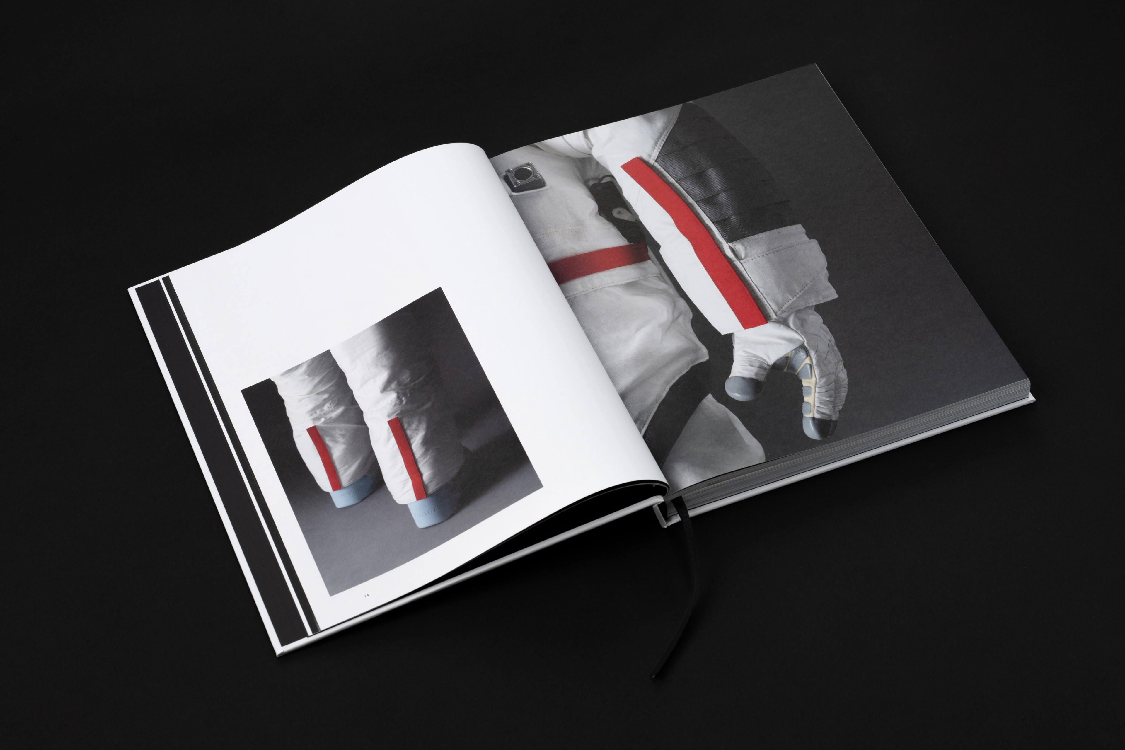
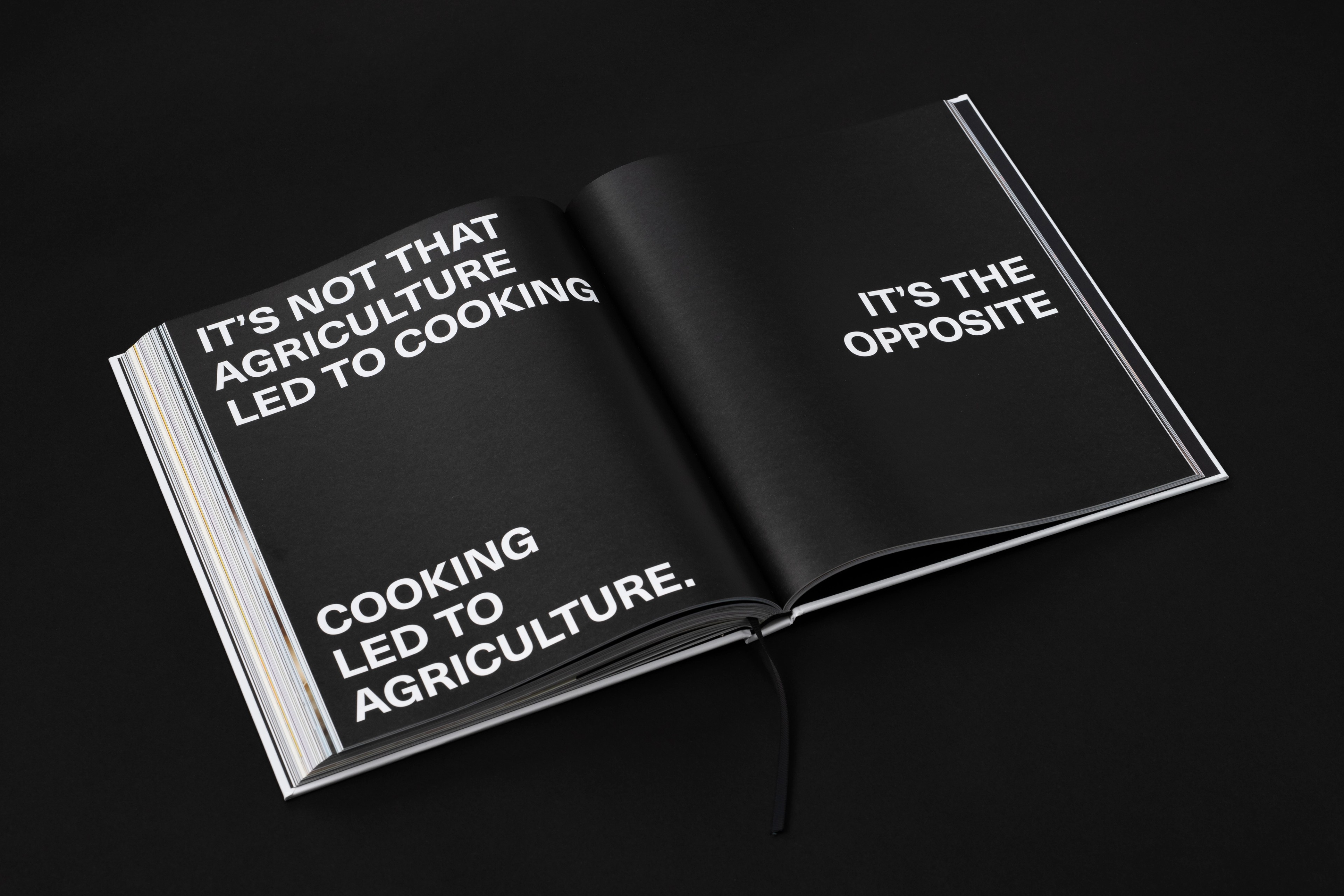
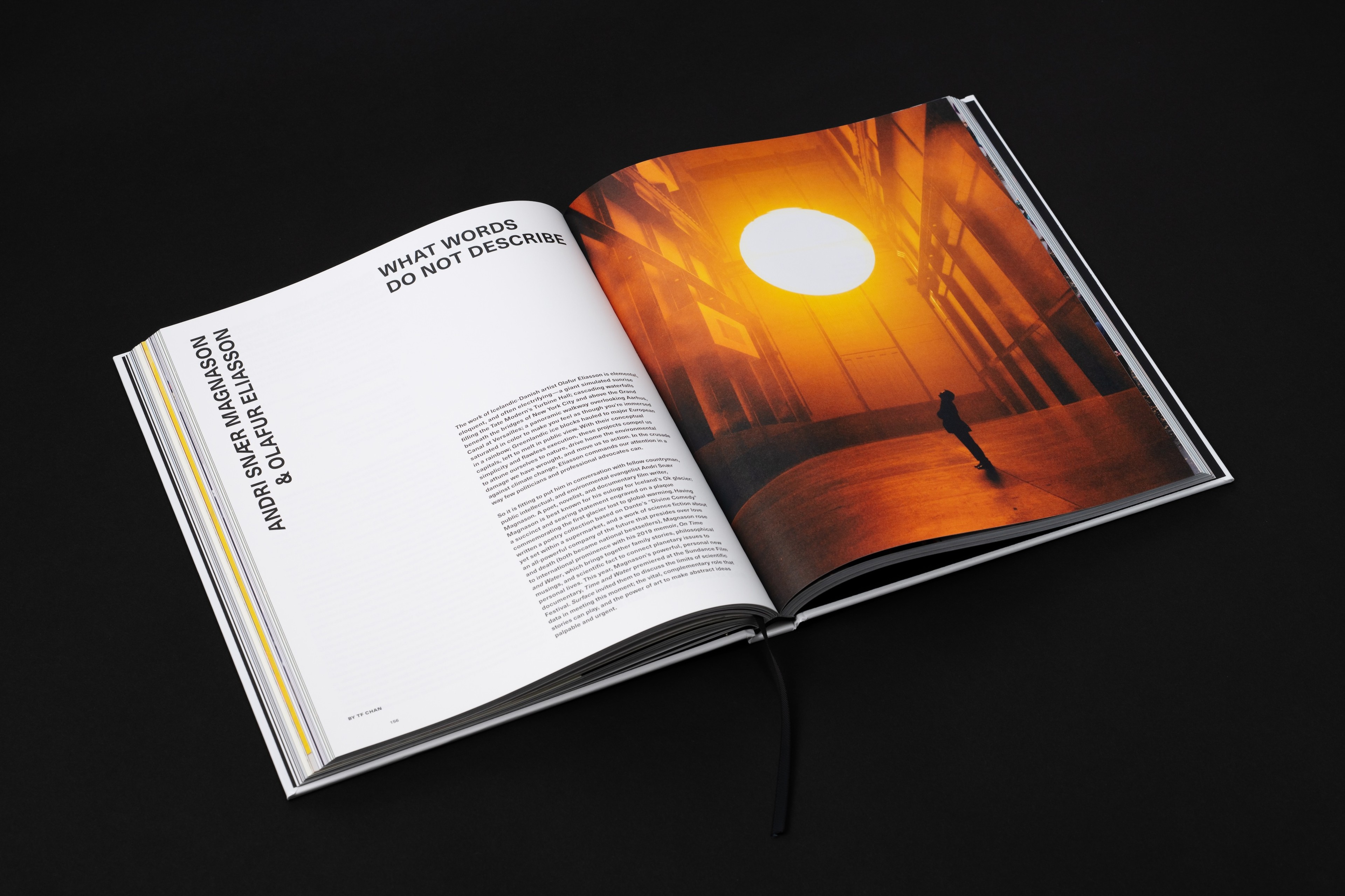
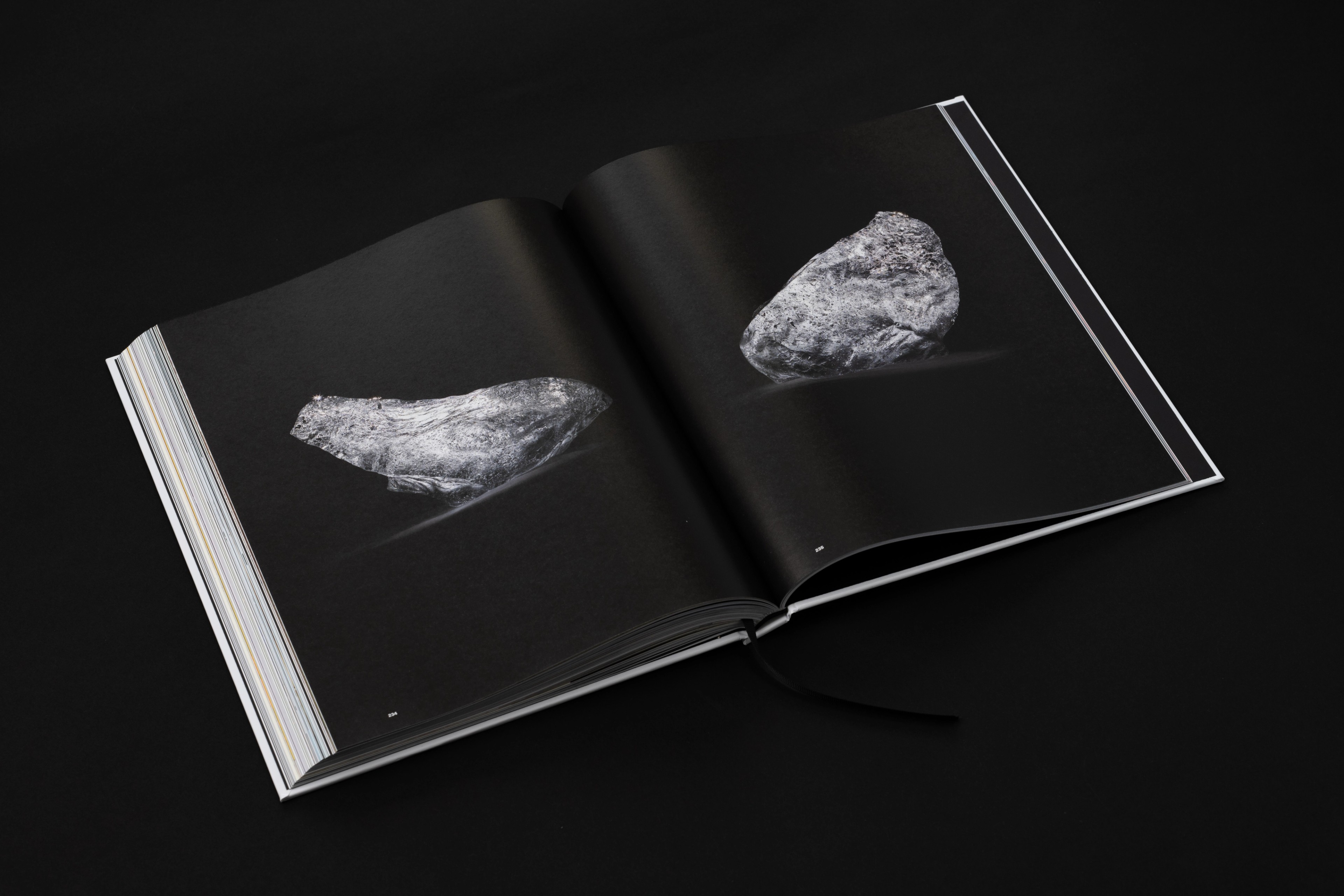
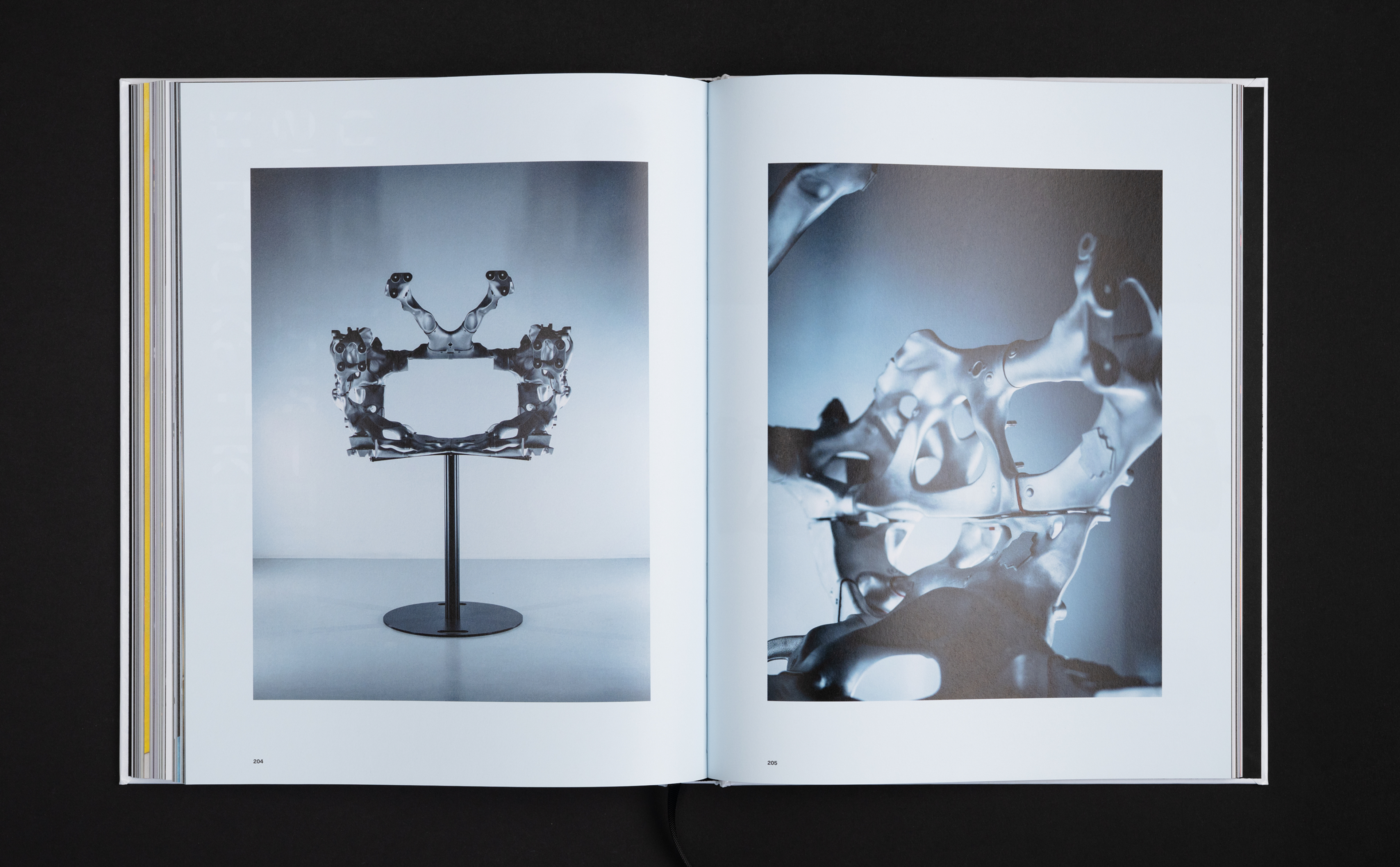
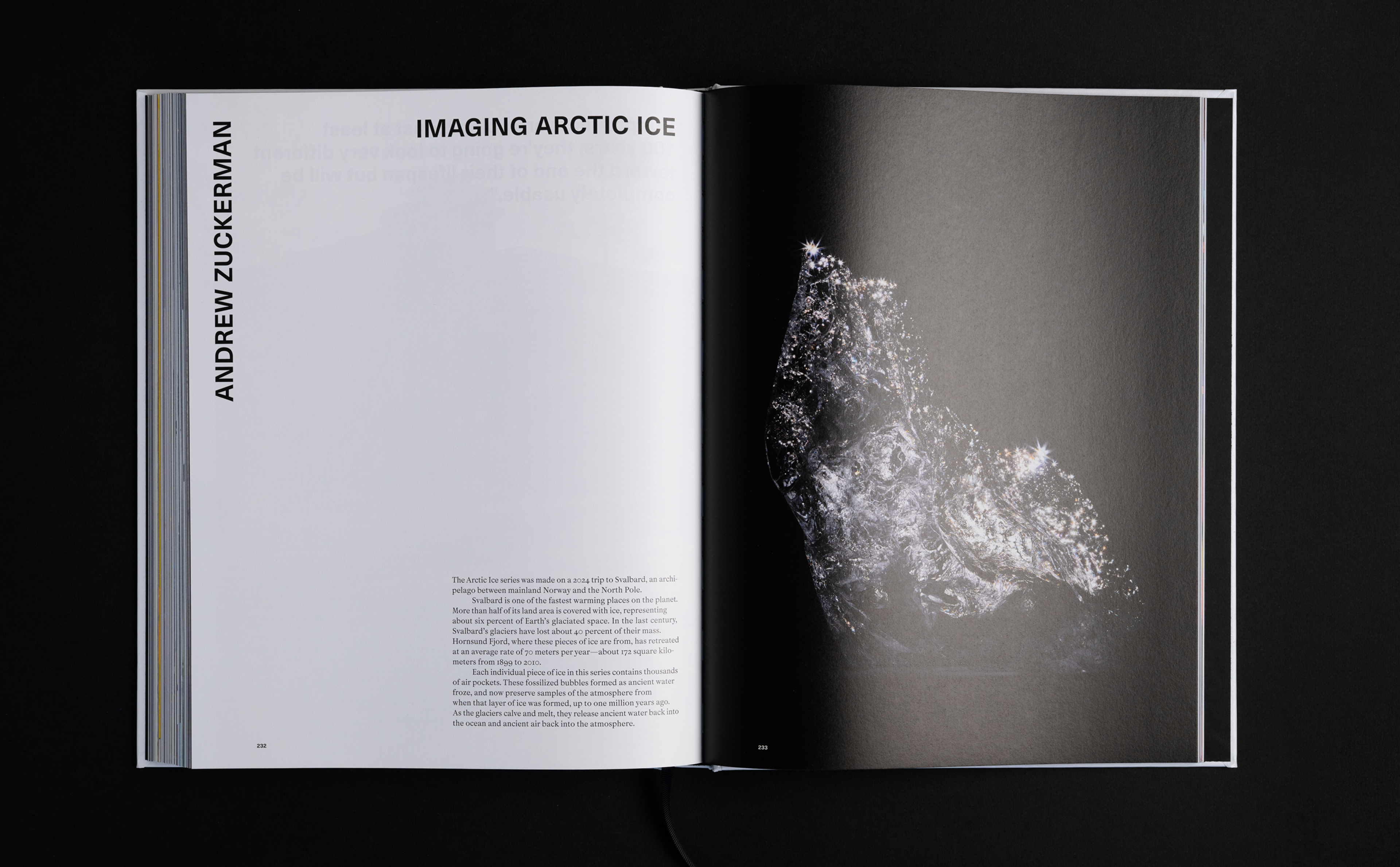
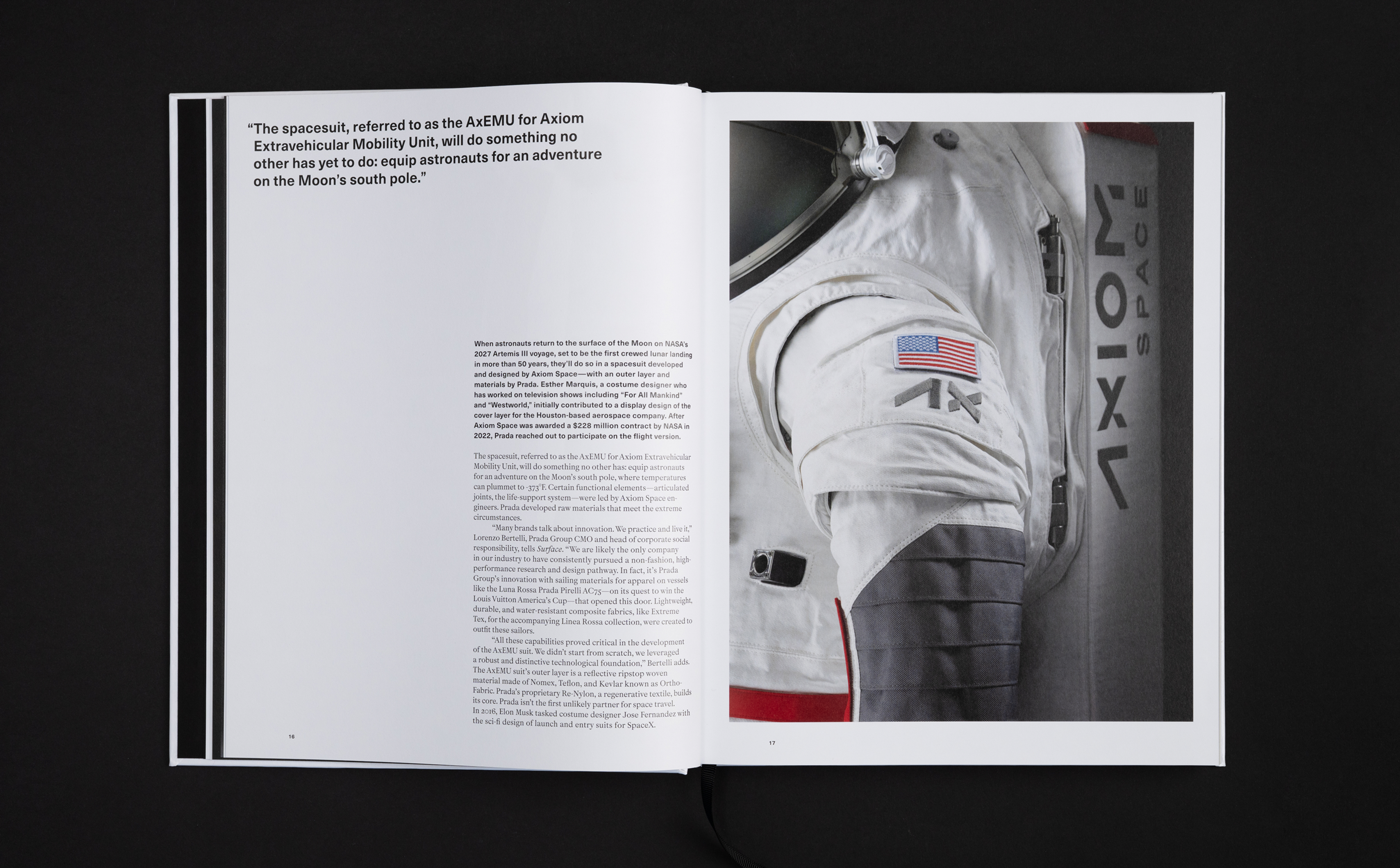
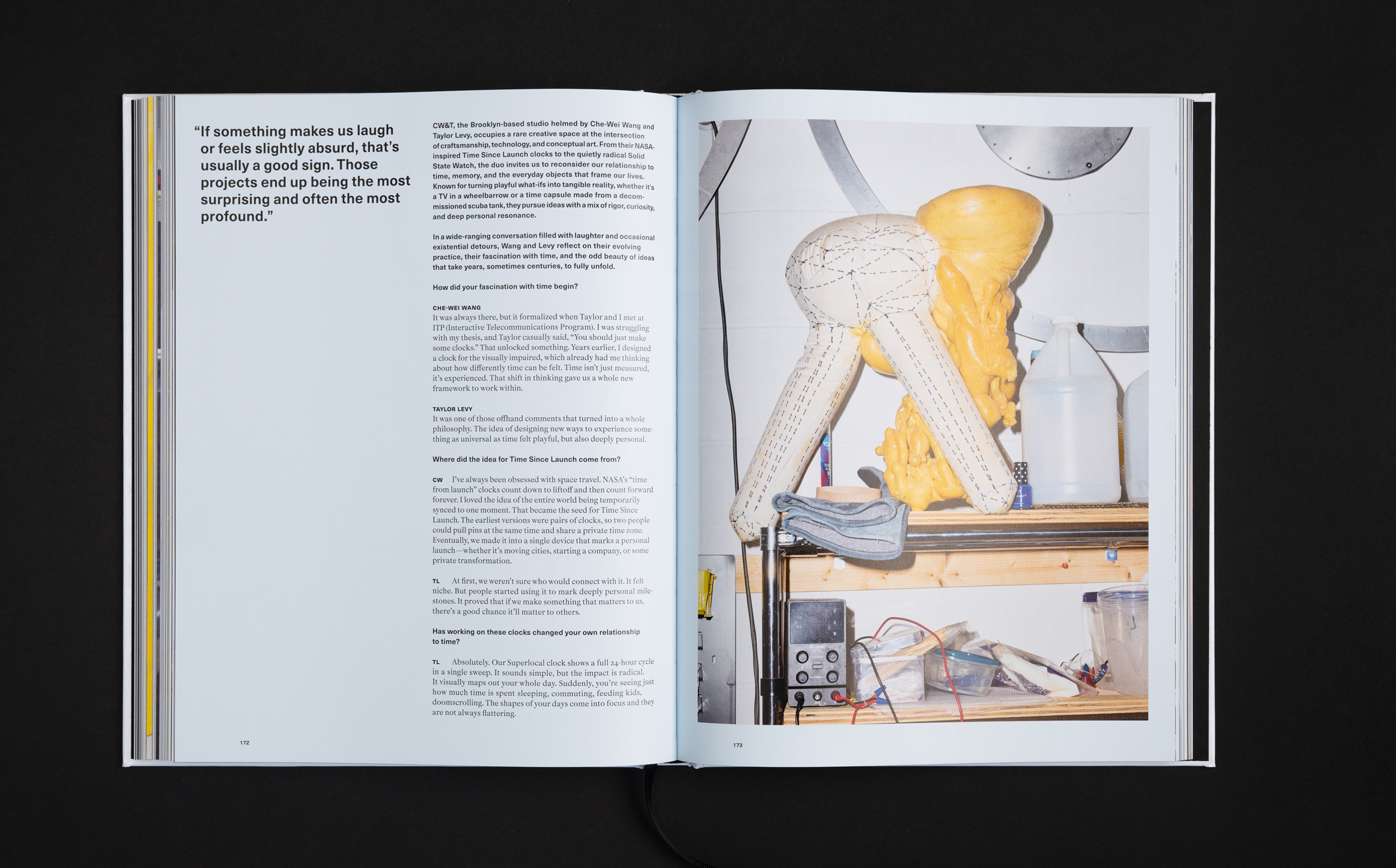
That partnership deepened for 2026: working in collaboration with the Surface team from content planning and pagination through to layout design, typography, and print production, we shaped the book from architecture to artifact. We balanced restraint with material richness, using foil stamping, embossing, and immersive photographic portfolios to let the stories breathe.
Sectors
- Culture
Locations
- Global
Services
- Design
- Content
- Production
Built to Carry the Name
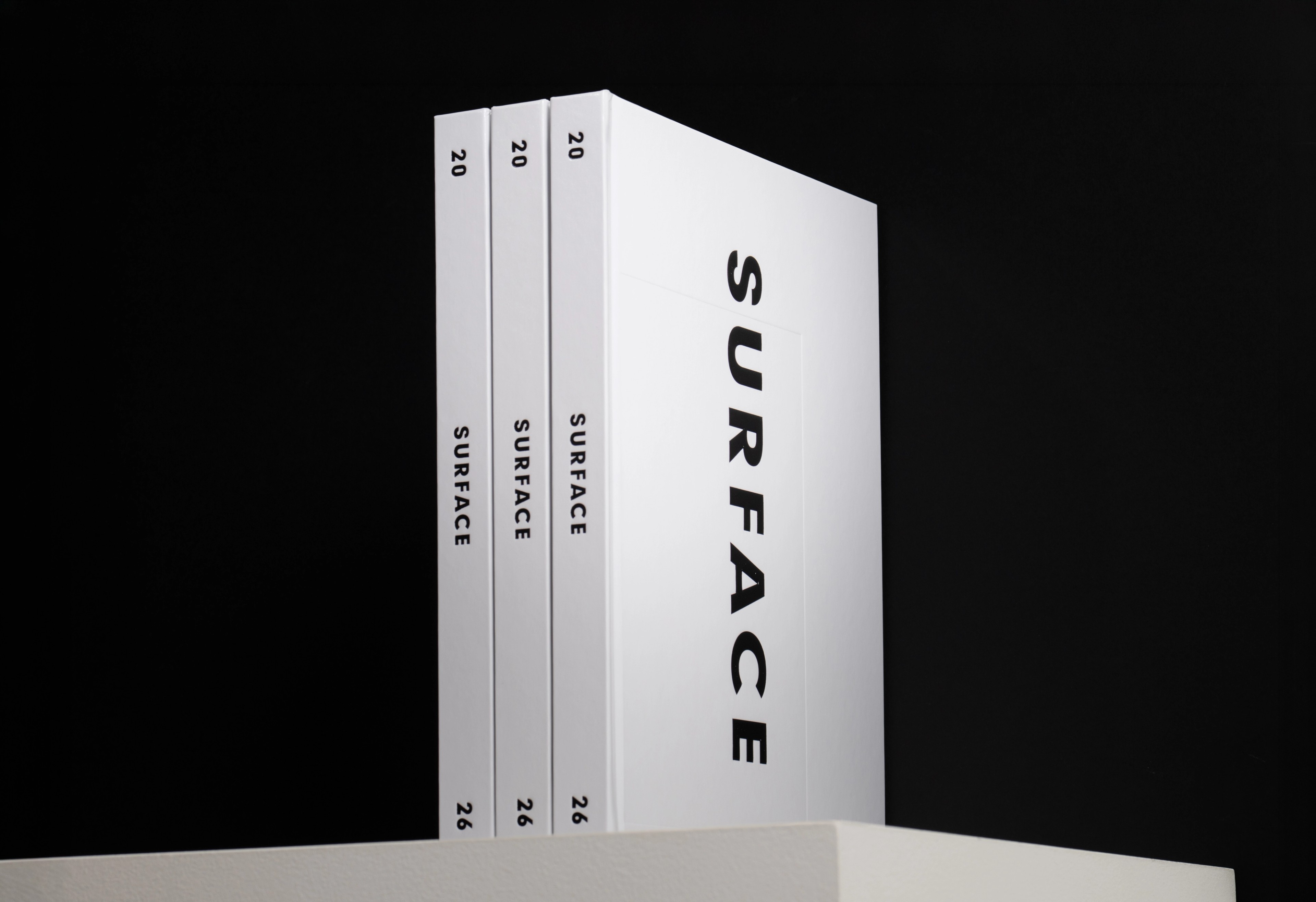
For the print edition we returned to the original Surface cover language, first developed in our 2013 rebrand of the publication. We tightened the typographic system so it holds up at scale, then brought the same rigour to the immersive photographic spreads inside. Every layout decision was made to give each story room to be read and experienced slowly, not scanned.
Marc Lotenberg, Surface CEO“We’re no longer just designing objects; we’re designing the conditions they live in: memory, electrons, nourishment, attention. The future isn’t arriving from elsewhere. We’re authoring it.”
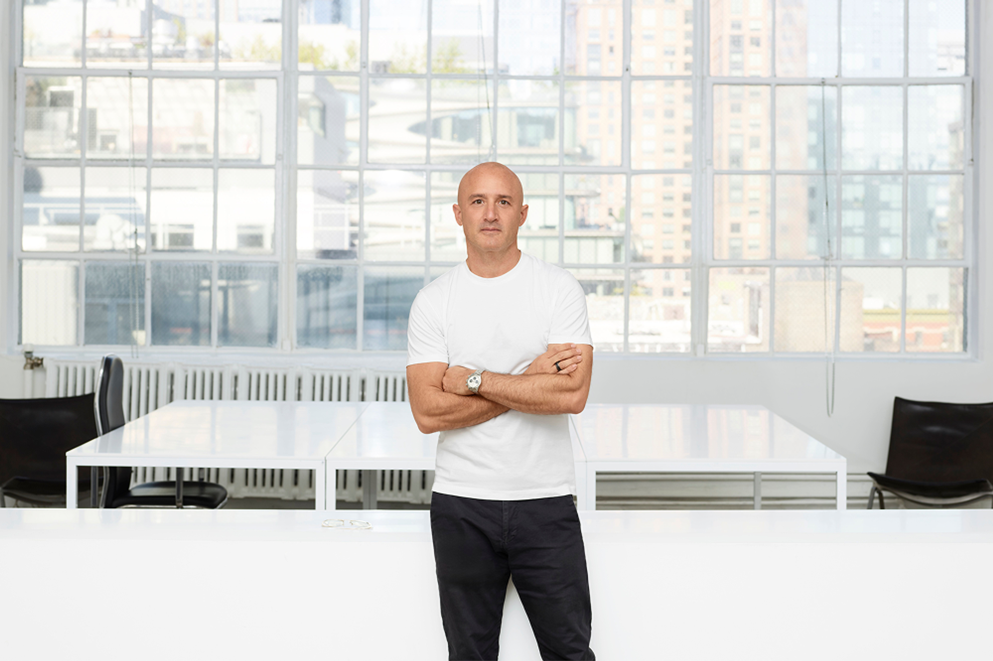
Andrew Zuckerman“When I discovered Surface as a reader 20 years ago, those early issues expanded my sense of design, not as a narrow discipline but as a connective tissue between fields."